Do forgive the Substack silence over the past month and a half or so. My partial excuse for slow posting is that I’ve spent the summer switching both jobs and home cities. I’ll now be doing The Economist’s coverage of the US economy, based out of Washington, DC. After a fair few flights and rounds of Airbnb-hopping, the bulk of that move is now thankfully done.
Which, for better or worse, lets me get back to Substack. Since I’ve spent much of the past few months with half my mind on Britain and half on America, I thought it’d be interesting to hop briefly through what I’ve written—and line that up with a few of the big themes facing each economy. This post is a fairly long one, so I’d recommend treating it as a buffet. Hover around and see which courses (charts) most inspire.
At the end of this post, I’ve also left a logistical note about how I plan to use this Substack going forward. In brief: expect more of a mix of British- and American-focused writing. And there is a way to opt out of pieces on either country, for subscribers who’d rather not bore themselves with happenings on the opposite side of the Atlantic.
Let’s start with Britain.
There were a few topics that I thought had been under-covered in journalistic and policy writing about the British economy, which I was keen to touch on before I wrapped up that job.
Of those, energy is probably the most consequential.
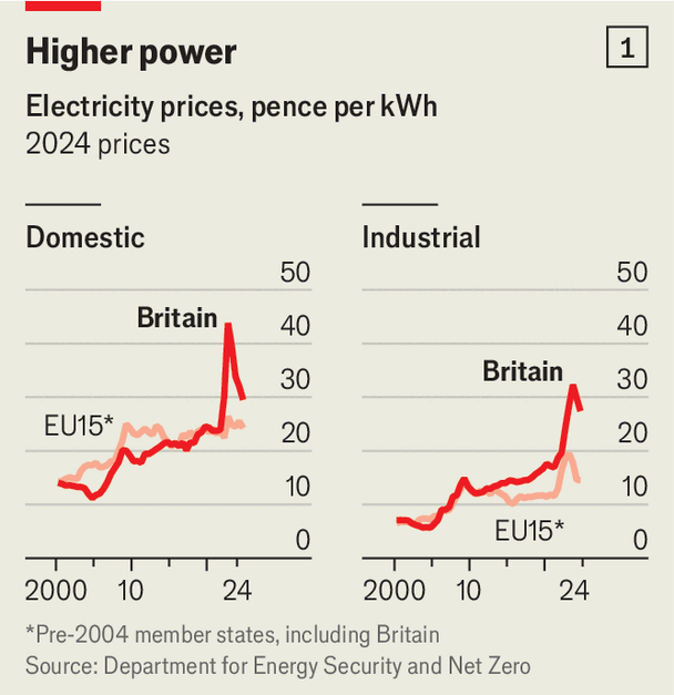
Britain now has real issues with energy costs and scarcity. (Anyone who has already read my spiel on this, feel free to keep scrolling.) Until a few years ago, electricity was about as expensive in Britain as in continental Europe, and had been for decades. Today, bills are sharply higher in Britain. Reasonable people can disagree about exactly how much of a problem that is, but I worry.
Unlike, say, housing costs, which have been a problem for a long time—if an ever-worsening one—this energy issue is relatively new. Britain is still learning what the economic and political consequences of having some of the world’s costliest power will be.
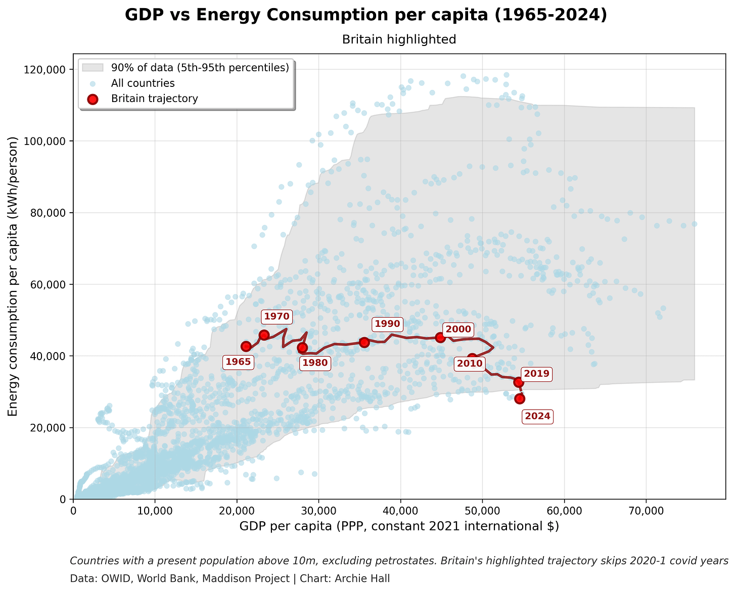
But, it’s safe to say that Britain is now in uncharted territory. No other country has been this rich while consuming this little energy, as the chart below shows. That trend could well be spun positively, as a triumph for energy-efficient growth. My suspicion, though, is that this is an issue: adding an energy constraint to an already-faltering economy could be a problem for future growth.
The comparison with Europe is particularly illuminating, since other European countries are faced with the same (high) wholesale natural gas prices as Britain. So the standard explanation for high electricity prices in Britain, which pins almost the entirety of the shift on still-high gas prices following Russia’s invasion of Ukraine, is clearly incomplete.
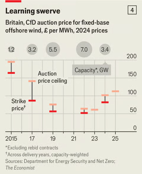
A decent share of the blame, in my view, goes to each of: gas prices, historical policy decisions (no new nuclear power since the 1990s, pushing coal off the grid in the 2010s), and current ones (the sprint to clean power by 2030). Particularly worrying is the fact that the workhorse technology of Britain’s energy transition, offshore wind, seems to have stopped getting cheaper.
The most in-depth critical response my piece received was from Andrew Sissons. Do give it a look; I’m grateful he took the time to engage. I don’t want to get into too much of a tit-for-tat, or mess with the flow of this piece, but you can see some of my responses in the footnote here1.
That’s a fairly brief tour of a complex and messy area. To wrap up, I’d add two observations.
First: the politics of net zero are likely to get tougher from here. Polling commissioned by my colleague James Fransham found that voters say energy bills will do more than any other measure to determine which party they support in 2029.
“For example, the biggest vote-swinger is lower energy bills: 54% of adults of all stripes said they would be more likely to support Labour if prices fell; just 13% said a clean-power target would increase their support.”
And, irrespective of one’s views of the merits of current net zero policy, those costs are almost certainly going to making up an ever-larger share of electricity bills.
Second: Britain’s power as an exemplar goes two ways. I ended my piece on this note:
“These days, Britain’s carbon emissions are not far off a global rounding error. By phasing out coal so quickly, Britain has also already cut emissions by more than just about any rich country. The bet behind today’s clean-power push is that Britain can be a trailblazer, and show how to painlessly decarbonise the grid even without much cheap solar power. But taking that prospect seriously also means entertaining the opposite risk. A botched transition would be not a model but a warning.”
That was rather a lot on energy! Not a topic that’s easy to dip quickly in and out of, though. I promise the rest of the what-I-wrote-this-summer tour will be briefer.
The other main topic was what I call “Bargain Britain”.
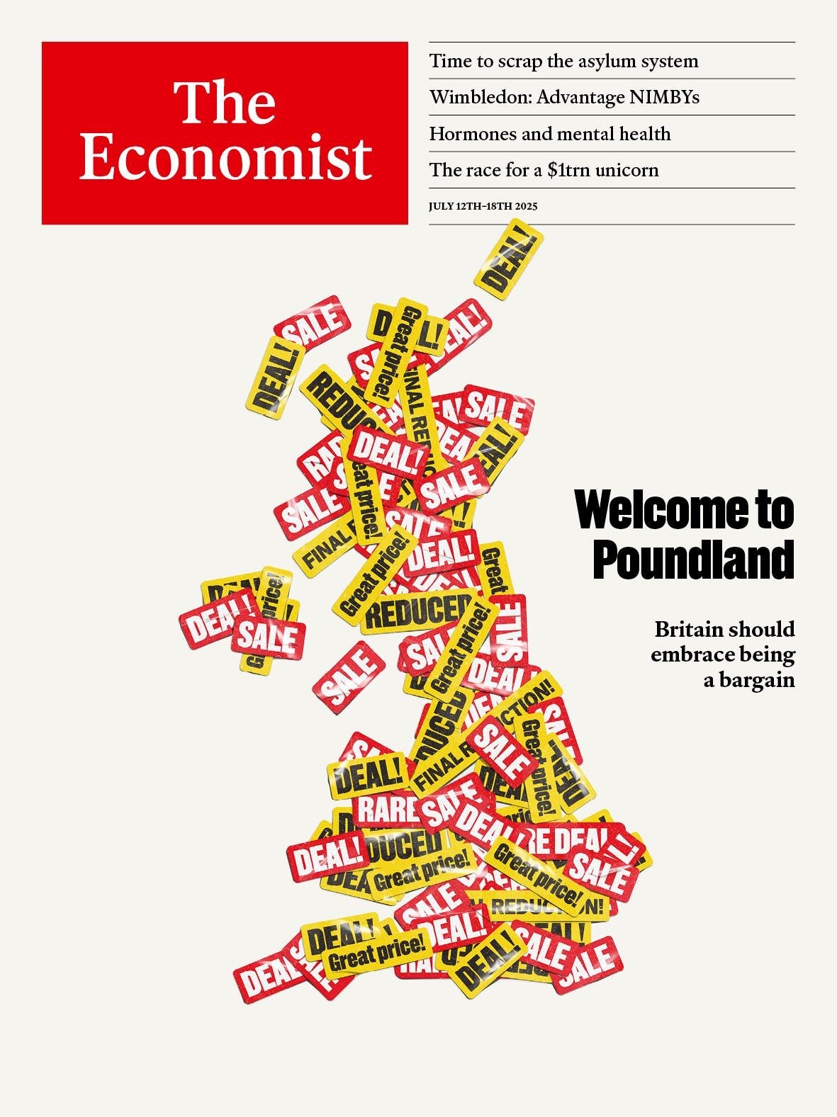
Amid all the gloom about Britain’s economic prospects, I’d been keen to find a slice of optimism. One framing I found myself returning to was whether it was time to “buy the dip”: was Britain looking like a bargain? That’s what I argued on our “Welcome to Poundland” cover in July.
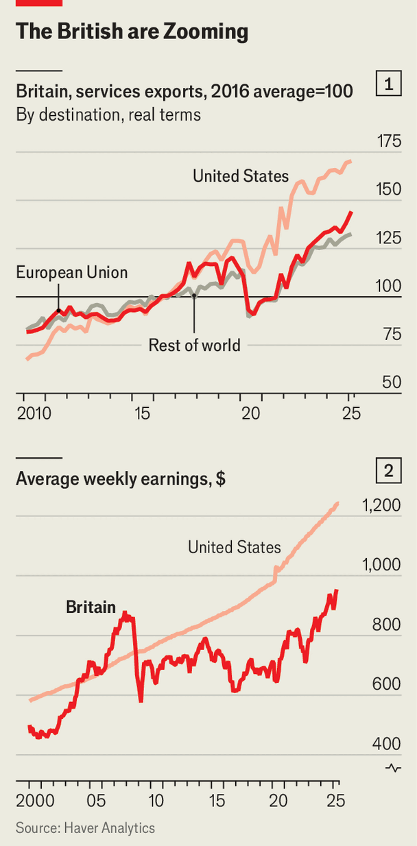
That story has two angles. There has clearly been dip-buying in the labour market. Britain’s cheap but well-educated workers fuelled something of a post-Brexit boom in services exports. The scale of growth there, especially in the context of Britain’s otherwise-anemic economy, is pretty staggering.
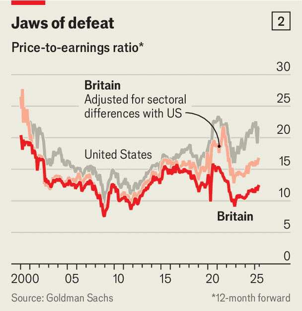
But Britain’s assets are also looking cheap, too. Whether they’re a bargain, though, is more in the eye of the beholder. There are lots of good reasons to think that Britain today is also a riskier jurisdiction to invest in than it may once have been, starting with the Liz Truss experience. You can see that in equity pricing, where Britain looks cheap even after adjusting for its lack of technology companies.
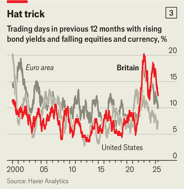
And you can also see that risk reflected in the co-movement of British assets. In particular, capital flight-style market dynamics, where British stocks, gilts and sterling all fall together, seem to have become more common.
But in all that risk, and cheapness, potentially lies opportunity! I tried to sketch out what a “Poundland strategy” for economic growth might look like in the accompanying cover leader article.
“The doomsters are right, but failure also contains a copper lining. Call it the “Poundland” strategy, after the bargain retailer that originally priced all items at just £1 ($1.36). Britain is cheap—cheaper than warranted by the obvious risks. If the government can seize the opportunity, then being value for money offers Britons a pathway to better economic growth.”
Where does all that leave Britain’s government, one year in?
Last month marked the first anniversary of Labour’s election win. Stepping back, how has the government done? The Economist’s overall verdict was: not terribly well. This is where my colleague Matthew Holehouse landed:
“The first birthday of Britain’s Labour government on July 4th will be a miserable, cakeless affair. The party’s polling is dreadful, trailing Reform UK, an insurgency from the right led by Nigel Farage. Promises to cut hospital waiting-lists, build more houses and stop migrant boats are off-track. And on July 1st Sir Keir Starmer was humiliated by a huge rebellion, as Labour MPs gutted a bill to cut sickness and disability benefits. In Parliament the next day his chancellor wept and yields on Britain’s debt soared. The prime minister has never looked weaker.”
I looked specifically at how the pursuit of economic growth, notionally Labour’s top “mission” had gone. My tone echoed Matthew’s. A year on, there wasn’t all that much to point to. A landmark planning bill had been watered down. Little progress had been made on softening post-Brexit trade barriers, and even less on tax reform.
I warned about learning the wrong lessons from that faltering first year.
“Before pronouncing supply-side reform futile, Labour should first give it a proper go.”
Certainly, the cleanest measure of success on growth: whether Labour had persuaded GDP forecasters to get any more optimistic, wasn’t looking great.
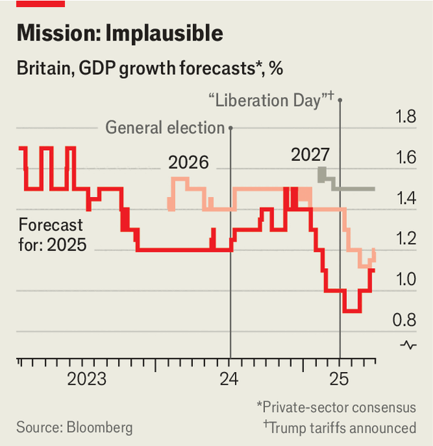
Since then, there are a few reasons to be a touch more cheerful. The latest round of GDP figures and PMI surveys came out better than expected. (And would probably make the chart above look better if it was more up-to-date. Sadly I don’t have a Bloomberg terminal to hand right now to re-make it and check.) And there’s been a fair amount of reporting that the PM is keen on a second go at planning reform. Here’s to a better Year Two.
And then America
Britain’s economic issues are mostly structural and slow-moving. Correspondingly, my focus when writing about Britain has tended to be wide and thematic. America is in a bit of a different position. The five- or ten-year story is a strongly positive one: recent American growth has outrun every one of its peers. But zoom in on 2025 specifically and things look shakier.
I’ve spent my first few months writing about the US trying to take stock of that potential slowdown from a range of angles.
Have tariffs hit growth?
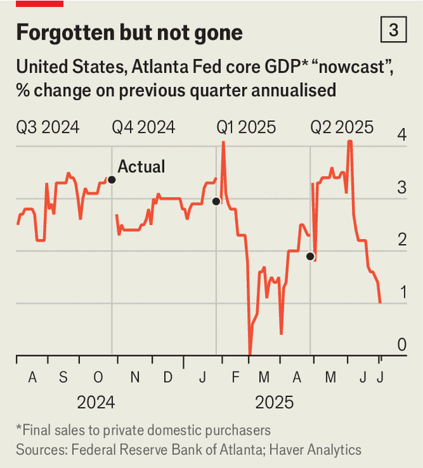
In early July, I wrote that some American economic data was starting to look weak. Since then, revised payroll figures have confirmed that impression (although, interestingly, the gauge I show below—the private consumption and investment slice of the Atlanta Fed’s GDPNow tracker—is now a touch stronger, at 1.9%).
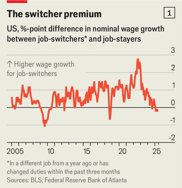
A more fun measure of economic weakness is the “switcher premium”: how much higher pay growth has been for people who moved jobs, versus those who stayed put. Not a good time to job hop at the moment, it turns out!
What about the rest of the economy?
The classic interest-rate-sensitive sector in America (and elsewhere) is housing. A slowdown there can be an early warning signal that monetary policy is looking tight, and further economic pain may be coming.
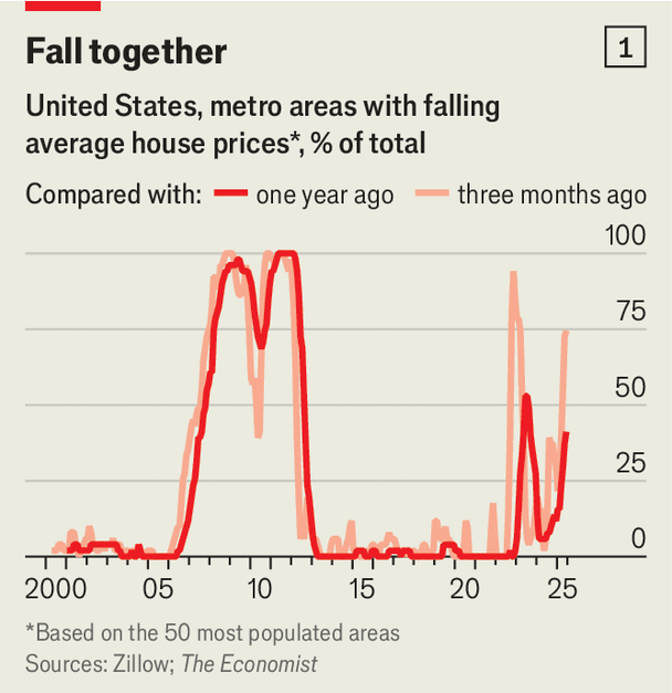
Today, housing looks very soft. Home prices have fallen in three-quarters of big American cities over the past few months.
Interestingly, there is a regional pattern to that weakness: the Northeast and Midwest are holding up better than the South and West. You can see an interactive version of the map below here.
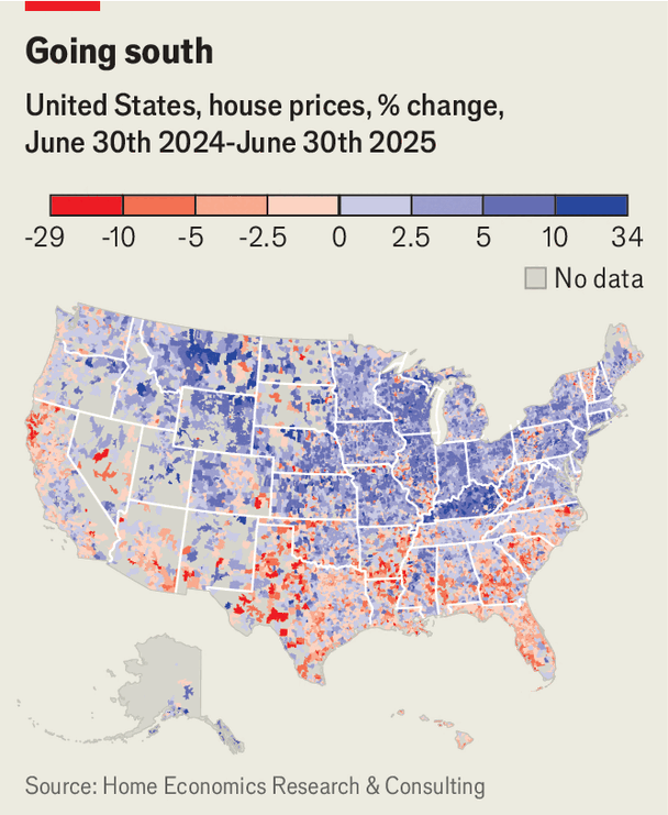
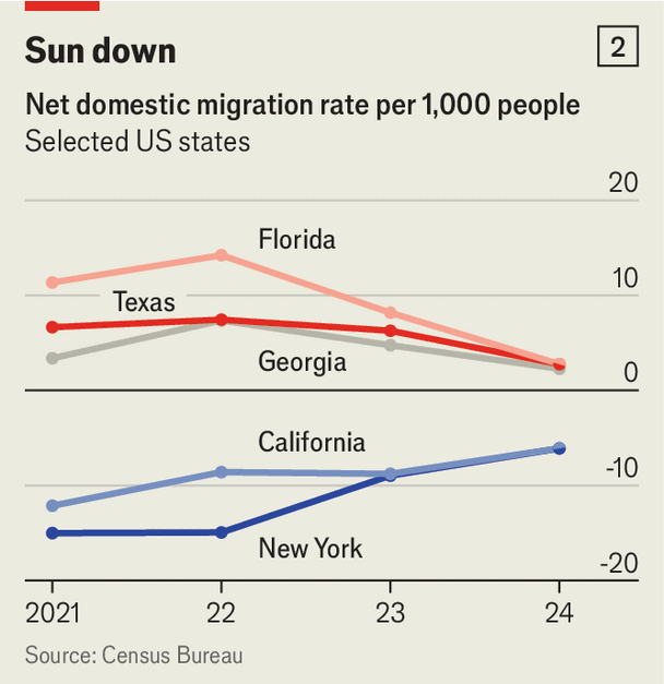
Part of the story (there’s lots going on, do read my full piece) is that a big post-Covid trend seems to be cooling down: the vast domestic migration from the coasts to the Sun Belt. If that reversal continues, a fair few political narratives premised on that trend (particularly a sort of red state triumphalism) may need to be rethought.
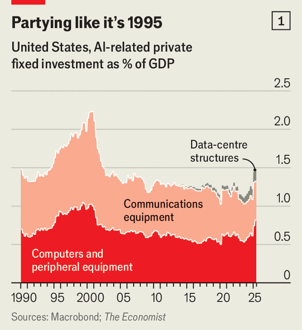
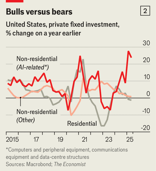
Conversely, a newer slice of the economy is doing extraordinarily well: the AI buildout. Growth in data centres and related equipment has been big enough to account for roughly half of America’s growth so far in 2025, and a sixth over the past full year. For a sector that makes up 1.5% of GDP, that’s pretty remarkable.
That growth has probably even been strong enough to keep interest rates higher, and so squeeze down other sorts of investment. Housing developers are a lot more responsive to interest rates, it turns out, than superintelligence-builders.
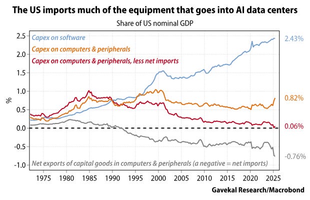
There is one asterisk to that story, which I didn’t emphasise as much in the piece but this chart from Gavekal captures well: the GDP impact is not totally straightforward, since a good share of the components for that AI buildout are imported.
How shaky is America’s overall economic credibility?
A theme I’m increasingly concerned about, now that I’m back in America, is the scale of institutional rot. (Plenty of British institutions by contrast certainly have a competence problem, but aren’t under political threat in quite the same way, at least so far)
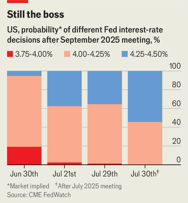
Core to that is the Federal Reserve. For the moment though, despite the blows the Fed is sustaining, markets are very far from treating Jerome Powell as a lame duck. One way to see that is by looking at just how far priced-in expectations for a rate cut moved after Powell gave a hawkish press conference at the last FOMC meeting (see the growing blue bar). Since I wrote that piece, softer data and a dovish tone from Powell at Jackson Hole have yanked pricing back to roughly where it was at the end of June, on the far left of this chart.
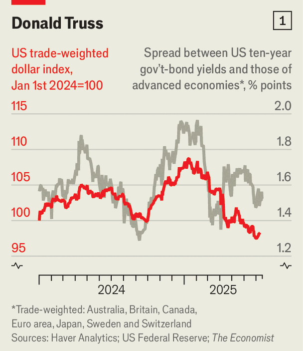
Another worrying theme is the emergence of a risk premium in the dollar since “Liberation Day” in April. There’s a fair bit of disagreement about how real this is (here’s Robin Brooks arguing there’s not much to see), but at a first pass the dollar has traded below where you’d expect interest-rate differentials alone to leave it since April.
Drama in the cities
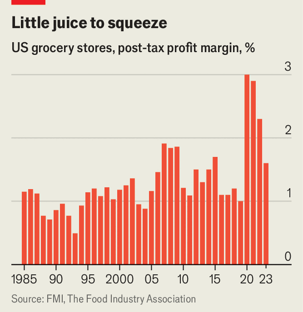
One piece of the new job that I’ve been looking forward to is the chance to tell a few more hyper-local stories. I started, in June, with New York, the city in America I know best. Despite having spent several years as a victim of New York’s high grocery prices, I was sceptical that Zohran Mamdani’s solution of city-run supermarkets had much promise:
“At best, then, these stores might sell groceries a smidge more cheaply than conventional grocers, largely due to back-door taxpayer funding. For a government concerned about affordability for the poorest New Yorkers, indiscriminately part-financing the grocery haul of anyone who steps into one of Mr Mamdani’s stores is a curious way to do it.”
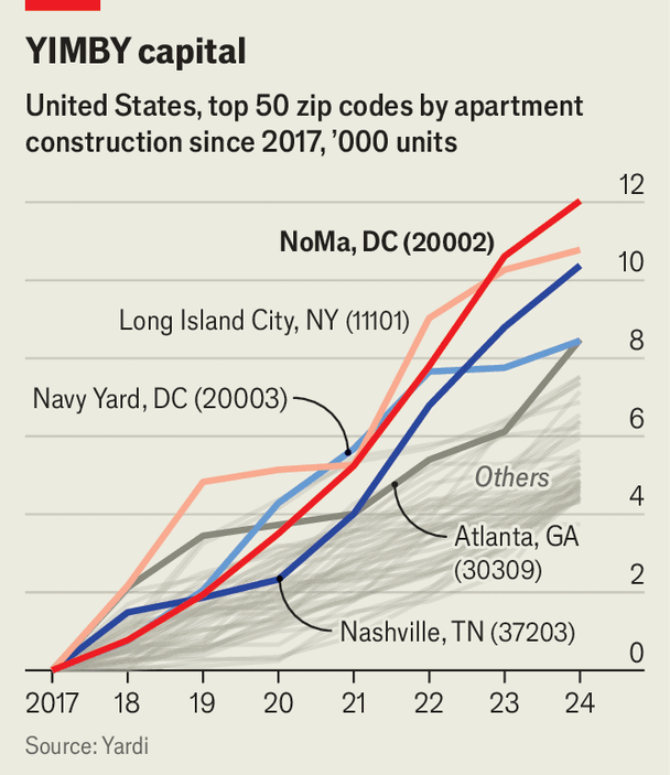
Meanwhile, while house-hunting in DC, I found myself far more charmed by the ideological underpinnings of the NoMa neighbourhood (large-scale and rapid apartment-building, the stuff of pro-housebuilding YIMBY dreams) than by the architecture itself (rather blocky and bare).
“Persuading yuppies to move to “Swampoodle” was always going to be an uphill battle. So when the ex-industrial zone next to Washington, DC’s main railway station was slated for redevelopment in the 1990s and 2000s, the authorities ditched the neighbourhood’s original 19th-century name, which had already fallen into disuse. Instead, they christened the wider area “NoMa” (“north of Massachusetts Avenue”), a syllable or two away from trendy locales like NoMad (in New York) and Soho (in each of New York, London and Hong Kong).”
But, the scale of building there has been remarkable. I’d encourage anyone interested in this to spend five minutes clicking around Google Street View anywhere nearby Union Market, and comparing the skyline today to a decade ago. Here’s a street around there that I picked pretty much at random in 2016 and last December.
That neighbourhood also, I argued, carries lessons for the country.
“America will need many more NoMas. After a century of mainly expanding outwards, cities across the country are nearing the limits of suburban sprawl. Next comes building upwards. NoMa was YIMBYism on easy mode. Cracking the politics of that shift elsewhere may well be a tougher task.”
Hopefully there were titbits of interest on that tour. My next few posts on here should be more structured, and take less than a month and a half to arrive.
As promised, a quick operational note to end, on what to expect from this Substack going forward.
Despite the new job, I don’t expect the broad formula of what I write here—riffing and expanding on themes that I cover for The Economist—to change much. But the focus probably will shift. Still, do stay subscribed!
I expect something like half of what I now put on here to be America-focused, drawing on my writing in the same way previous posts here on Britain have. The other half will stay Britain-focused. (Time permitting, I’m planning to write some more zoomed-out and thematic surveys of the big obstacles for Britain’s economy, and at which policy solutions do or don’t look promising.)
As that switch happens, I’m conscious that not everyone will want everything landing in their inboxes: By default, subscribers will still get every post, but for those who would like to choose, I’ve added the option for people to turn off emails for either Britain- or America-centric pieces.
You can find this menu by clicking on your account picture on the top right and then going to “Manage subscription”, and scrolling down to “Notifications”.
And more than usual now, I’m planning to play around a bit with the format and length of posts. Do let me know, either in comments or by email, what if anything you find most valuable as a reader, and what I could get away with doing less of.
And some specific responses to the critiques of my writing on British energy costs from Andrew Sissons.
He stresses that renewables are a high fixed-cost low marginal-cost technology, and that sometimes—when the wind is blowing and the sun is shining—Britain’s power mix can be very cheap for a few hours. There are absolutely opportunities to optimise energy demand for times when power generation is higher, like, shifting around when electric cars get charged.
But lots of demand is pretty inflexible, and a system that fails to provide enough cheap power when people need it is clearly one with problems. Hence the high bills that choke growth.
He says I misdiagnose the main reasons why offshore wind has been getting more expensive, namely construction inflation and financing costs. On one level that is all true; it would be peculiar indeed if the actual technology behind offshore wind had gotten worse and pricier since 2022. But those factors have mattered so much for costs only because the background process of technological innovation driving rapidly-falling costs (as is happening with solar power) seems to have stalled for the moment. That is a huge issue, and one he waves away.
Like it or not, the offshore wind capacity procured at the next few CfD auctions is going to lock in prices of a substantial share of Britain’s energy market for decades to come. If those costs are going to be high, we should pay close attention.
He calls my work backward-looking. To an extent, fair enough! But properly understanding how Britain has ended up with high electricity bills is rather important, in my view, and there’s a lot of shoddy thinking swirling around. Any serious policy proposals will need to be informed by a rigorous, not caricatured, understanding of why Britain is where it is. My aim was to help inform that project. Certainly, though, there’s lots of work to be done!


